

As patent offices worldwide move toward color, a fragmented regulatory landscape demands a smarter filing strategy.
Key Takeaways
- The PCT effectively prohibits color drawings under Rule 11.13(a). This creates a significant challenge for early applicants because when WIPO converts those color pages to black-and-white for publication, critical technical details may be lost during conversion.
- The global trend is unmistakably toward color acceptance. WIPO’s International Bureau is actively piloting technical solutions to support native color and multimedia processing in international filings.
- Utility patent standards vary sharply by jurisdiction. The USPTO, CNIPA, UK IPO, and India have some of the toughest standards, whereas the EPO and South Korea are generally more flexible. Design patents, however, generally enjoy broader acceptance of color across jurisdictions.
- Bulletproof IP protection requires both airtight written descriptions and comprehensive drawings. Neither element alone is sufficient to defend a color-dependent invention across multiple legal systems.
Introduction
Patent illustrations are crucial visual disclosures required to satisfy the enablement requirements of international patent law. Black-and-white (B/W) drawings have been the universal standard since the late nineteenth century, valued for their consistent reproduction quality and low cost across print and digital formats. As modern inventions increasingly rely on color as a functional element, a fragmented global landscape has evolved in which the same drawing may be fully acceptable in one jurisdiction and flatly rejected in another. This article examines that landscape and offers practical strategies for navigating it.
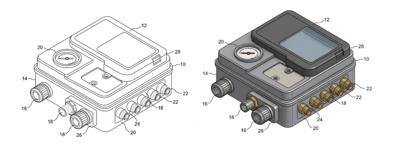
Figure: Color versus black-and-white patent drawings. The monochrome version (left) obscures key technical distinctions and functional relationships; the color version (right) renders those relationships immediately legible.
The Chromatic Revolution: A Cross-Border Comparative Analysis
The use of color in patent illustrations is reshaping patent drafting and filing practices across multiple jurisdictions. What was once a rare administrative exception is rapidly becoming a practical necessity for certain technologies. The table below summarizes the legal differences between jurisdictions that fully embrace color, those taking a hybrid approach, and those adhering to more conservative frameworks.
| Jurisdiction / Office | Utility Patent Policy | Design Patent Policy | Core Regulatory Rules & Notes |

United States (USPTO) |
Restrictive; requires a formal petition and fee. | Accommodating; permitted without petition if central to design. | 37 C.F.R. § 1.84; requires specific statutory language in the text. Continuations require a new petition. |

China (CNIPA) |
Pragmatic; accepted when necessary for clarity. | Accommodating; supports concurrent protection of color. | Guidelines for Patent Examination Part I; allows color without demanding burdensome USPTO-style petitions. |
 United Kingdom (UK IPO) |
Hybrid / Conservative; color drawings are strictly banned. | Accommodating; color represents a design element by default. | Accepts black-and-white photos only if line art cannot capture the technical subject matter. |
 European Patent Office (EPO) |
Liberalized; permitted natively in electronic filings since October 1, 2025. | Accommodating (via EUIPO guidelines for EU designs). | Must be executed in durable, uniformly thick lines suitable for 300 dpi resolution display. Monochromatic and color views cannot be mixed. |

India (IPO) |
Conservative; requires black-and-white line drawings. | Liberal; color combinations can define the essence of a design. | Rule 15 is silent, but practice dictates rejection of color utility drawings. Designs require explicit novelty statements. |
Reading the Landscape
A few patterns emerge from this comparison worth keeping in mind:
- Design patents are consistently more accommodating than utility patents: Because color is fundamentally a design element, offices that would reject a colorized technical drawing in a utility application will readily accept it in a design filing. Applicants with inventions that have both functional and ornamental dimensions should consider whether parallel filing strategies such as utility and design filings, which could provide broader protection.
- The EPO’s 2025 liberalization is a landmark shift: For decades, European practice mirrored the conservative U.S. approach. The October 2025 rule change brings the EPO into alignment with the broader global trend and reduces the compliance burden for applicants filing simultaneously in Europe and more permissive Asian jurisdictions.
- The PCT remains the most significant bottleneck: Even as national and regional offices relax their standards, the PCT’s Rule 11.13(a) continues to prohibit color. Any application entering the international phase must be prepared for black-and-white conversion, and that conversion must not destroy the technical disclosure.
The implications extend beyond patent prosecution. During litigation, opposition proceedings, and post-grant validity challenges, parties may examine whether color-dependent features were adequately disclosed in the original application. Moreover, if critical technical distinctions disappear when drawings are converted to grayscale, opponents may argue that the specification lacks sufficient support for later claim interpretations. Thus, color should be viewed not merely as a drafting convenience but as a factor that may influence enforceability years after filing.
Strategic Recommendations for Multi-Jurisdictional Filings
Managing a patent portfolio across multiple jurisdictions requires more than a one-size-fits-all approach to patent drawings. When color is vital to explaining an invention, an airtight conversion strategy is required from day one.
1. Create a Master Set for Both Formats
Never draft an invention using only color illustrations. From the earliest filing stage, build a dual-format drawing library. This collection should include two identical versions which includes a master black-and-white set that complies with strict patent offices (like Japan, India, and Egypt), and a high-resolution color set tailored for more flexible regions (such as the EPO, KIPO, and Saudi Arabia). Both sets must use the exact same part numbers, labels, and boundary lines. This prevents devastating “added matter” rejections during the prosecution of applications abroad.
2. Describe Color Details Directly in the Text
Because the PCT process and certain national offices may require conversion to monochrome, a written specification needs to be strong enough to stand on its own. The drawings should not serve as the sole source of technical disclosure. The text itself must explicitly define what the colors represent.
- For Tech & Engineering: Rather than just showing a blue-to-red thermal gradient, explicitly state: “The blue region represents a temperature range of 20°C to 30°C, while the red region indicates a hot spot exceeding 80°C.”
- For Life Sciences: Back up color figures with text-based data. Use specific wavelengths, exact concentration levels, or recognized industry color charts, such as the Royal Horticultural Society system.
3. Test and Simulate Black-and-White Conversion
Evaluate the quality of color images by running them through a grayscale simulation during drafting. The adequacy of the disclosure may be compromised if distinct zones or delicate gradients become indistinguishable in grayscale. Before filing, remove these visual obstacles by using text labels, dot patterns, unique textures, or cross-hatching. This ensures that the technical subtleties stay crisp and legally protected even if the drawings are converted to monochrome during examination or publication.
4. Set Up a Detailed Quality Control Review
Before submitting foreign filings, national phase applications, or continuations, run every drawing through a final QA review and verify the following:
- Every reference number aligns perfectly between the text and the artwork.
- Line weights and contrast levels remain crisp and readable at 300 dpi or higher.
- All necessary lead lines are intact and pointing to the correct features.
- The package complies fully with local country rules, petition mandates, and fee schedules.
Conclusion
Global patent offices are steadily shifting toward greater acceptance of color-based disclosures. Developments at the EPO, CNIPA, KIPO, and within WIPO’s ongoing modernization efforts indicate that color is increasingly being recognized as a legitimate tool for conveying technical information. Yet significant differences remain, particularly within the PCT framework and among more conservative national offices.
Until greater international harmonization emerges, applicants should adopt a disciplined dual-format strategy, maintain drawings that remain intelligible in both color and monochrome formats. Applicants should ensure that written descriptions independently support all color-dependent features. Those practices will enhance filing flexibility and improve the long-term enforceability of patent rights globally.